
Two Color Combinations for Your Home’s Exterior
Posted on May 16, 2019


An exterior painting project is a big undertaking, but that doesn’t mean you need to go neutral and singular with your color selection.
Using a two-tone color design scheme for your home’s exterior can add another layer of personality and help your home stand out––in a good way!
Location, light, architecture, and scale are all important things to take into consideration when having your home’s exterior painted. The expert team at CertaPro Painters® of Palatine, IL knows all the boxes to check when taking on such a large-scale project.
The stakes are high on an exterior painting project––not only are there a lot of surfaces to cover, but the finished product will be on display to the whole neighborhood. The wrong color scheme on a home’s exterior can paint a poor impression of the rest of your home, no matter how strong your interior design game is on the inside.
Your exterior painting project will also have to match your home’s architectural features, landscaping work, and climate. Climate is often overlooked, but temperature and weather play a big role in what paint should be used on your exterior painting project, as well as when it should be applied to achieve the best exterior paint color combinations.
Using a two-tone house color scheme for your home’s exterior can help it stand out from the rest. We know, we know––we just talked about how challenging an exterior painting project can be and now we’re suggesting you use not one but two colors! “Won’t that make things even more complicated?” you ask. Not if you have the right team on your painting project. Just because it’s a big undertaking doesn’t mean you need to keep your home’s exterior color scheme to one neutral color. A thoughtful color duo can make a flattering impact.
The team at CertaPro Painters® of Palatine, IL can help you select a winning exterior color combination and expertly apply it to your home’s exterior to create an impactful look with a ton of curb appeal. That curb appeal is not only great to enjoy while you’re still living in your home, but also becomes valuable when you’re looking to move. A sharp exterior painting project will help attract potential buyers when it comes time to sell.
How Two-Tone Paint Color Schemes Work

Before we dive into paint swatches and some of our favorite exterior duos trending right now, let’s first go over exterior paint schemes 101. Your exterior will generally consist of three colors for different areas: the body, accents, and trim. The body of your home is going to be the largest area that will be covered, which consists of the front, back, and sides.
Your home’s trim should showcase architectural elements. These include areas like door frames, porch railings, or window sashes. And finally, a complementary color to the main color of the home should be used as an accent color in a place you want to have some “pop”. A popular choice for incorporating this color is on the front door or shutters to create visual interest and curb appeal with a welcoming and unique entryway.
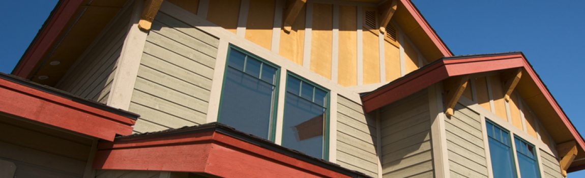
When we say “two-tone color scheme” we are talking about the addition of a second color to your home’s body color. The build of some homes works better for a two-tone color scheme than others. A lot of contemporary architecture includes homes that have overhangs or architectural elements that section off the front of the home. These places are a natural fit for a two-tone color scheme.
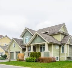
Traditional split-level or raised ranch-style homes also have that same built-in sectioning of their designs that would complement an additional hue. Incorporating a two-tone color scheme is all about highlighting those natural breaks in the home––whether it’s showcasing two different levels or textures.

This secondary color can be a subtle color contrast from your home’s primary body color or can be a much bolder choice that makes a greater impact. If your home is very modern in aesthetics and you want to push that envelope to make a particular architectural feature really pop, selecting a more non-traditional exterior painting color can add even more interest to a particular section. In contrast, a color that is just a few steps lighter or darker than your coordinating hue can create a subtle and tasteful appearance for more traditional homes.
What two colors you select for your home’s body color will largely come down to how dramatic of an impact you want to make. Keep reading to learn more about what you should take into consideration when making your palette selection.
Think About What Has to Stay
The best exterior painting projects fit seamlessly into their existing environment. When beginning to think about an exterior painting project, our minds tend to focus on the things that will be changing––how great the siding will look once its predecessor color gets painted over, how inviting the doorway will be once the door is a more favorable color. We often forget that not everything is going to be able to get an update.
It’s just as important to consider the things that will be staying. Things like your roof, bricks, garden, landscaping, mailbox, outdoor light fixtures, and patio or porch furniture are all pieces of your home’s story. You’re going to want to take cues from these existing elements of your home so you can build out a color story that really ties together all of the pieces into one cohesive design. If you live for gardening, this will be an especially important consideration for you when choosing an exterior color since you’re so connected to your outdoor space.
Color Duos for Contemporary Homes
Contemporary homes may have more dramatic architectural elements but often stick to a stricter color palette of neutrals. It’s a minimalist aesthetic that embraces flat and boxy shapes in the build. Contemporary homes tend to have a lot of opportunity for a two-tone exterior painting scheme because they often have a lot of depth to them from overhangs or areas of the house that may be more set back than others. Wood accents and unique building materials like glass and metals are popular within this design genre.
Two-tone exterior paint colors for this design can be a neutral color paired with a more saturated tone like a green or red that really will make an area of the home pop. We love Sherwin Williams’ Dard Hunter Green (SW 0041) with neutral Shiitake (SW 9173). Both are featured on their 2019 Sherwin-Williams Colormix® Color Forecast, which includes 42 trend colors specifically curated to work together easily.
A rich Merlot (SW 2704) with a neutral Nebulous White (SW 7063) are a hardworking duo pulled from the same color forecast. Both pairings bring together a neutral and a more vibrant hue that can create a bold contrast for your home’s exterior. Benjamin Moore’s exterior paint colors like Washington Blue (CW-630) and Gray Mirage (2142-50) are just one example of a two-tone color combination with blue paint. Contemporary architecture is daring and a dramatic pairing can fit right in to make your home an eye-catching staple in the neighborhood.
CertaPro Painters® of Palatine, IL offers a color visualizer to help you see what these color combinations would look like on your home’s exterior. The Virtual House Painter allows you to upload a photo of your home or choose from a library of existing interiors and drop any combination of color swatches onto the image to see how they jibe or don’t jibe, together.
Our CertaPro Painters® of Palatine, IL team is there to help you navigate your options when having your home’s exterior refreshed. Don’t let the size of the project intimidate you from having it completed. Our team of expert painters are familiar with the work and possess the skill needed to do the job efficiently to get your desired outcome. Call the team today at 847-963-1820 or schedule online to book an estimate to start the conversation about giving your home’s exterior some much-needed TLC!
